
4th Down Cloud was a strategic redesign of the legacy 4th Down platform—a system originally built for iPad-based sales training experiences in the biopharma sector. The new web-first, multi-tenant SaaS platform enabled global pharmaceutical clients to deliver individualized learning content across devices. The primary users included enterprise field teams, medical reps, and learning & development teams at Fortune 500 Pharma companies.
The Problem
Designing a platform is fundamentally different from building a consumer product. Where consumer tools can focus on a single user path, platforms must accommodate a constellation of users, permissions, workflows, and outcomes — all without losing clarity or coherence.
Enormous Scope
At the time of the transition, 4th Down's legacy platform had tens of thousands of users across dozens of enterprise customers, any product strategy involved intense ideation sessions with a wide variety of stakeholders, including:
4th Down Leadership
Provided strategic direction, business goals, and non-negotiables for scale and delivery.4th Down Client Team
Brought deep knowledge of current workflows, client needs, and technical feasibility.4th Down Development Team
Helped define system constraints, mapped legacy data structures, and ensured the atomic model could be implemented.Instructional Design & Content Specialists
Shared insights on how sessions were built, adapted, and reused across client programs.Partner Creative Agencies
Contributed external design patterns, branding frameworks, and unique content types that needed to be accommodated without fragmenting the system.Enterprise Client Leadership
Set expectations for visibility, performance tracking, and alignment with organizational outcomes.Enterprise Training Teams
Highlighted pain points in authoring, localization, and scheduling that influenced system architecture and tool design.End Users (Learners)
Their preferences, behaviors, and feedback loops helped shape the structure of sessions, navigation, and content delivery pacing.
I eventually broke these down into 3 categories of stakeholder:
Internal Needs
Clients needs
Users needs
Technical Debt
Before the redesign, the platform suffered from several limitations:
It was iPad-only and lacked cross-platform flexibility.
The infrastructure was optimized for in-person events.
Each client deployment was a heavily customized one-off.
The UI was inconsistent and optimized only for touch-based interactions.
Internal teams lacked tooling and standards, resulting in duplicated effort and bugs.
Clients demanded brand control and flexibility, which the system struggled to support.
Users would often find themselves lost, and did not have proper feedback of progress.
Meanwhile, external market forces—most notably the 2020 COVID-19 pandemic—accelerated the demand for scalable, remote-ready learning solutions. Suddenly, the existing product could no longer meet the needs of clients who were forced to cancel in-person events.
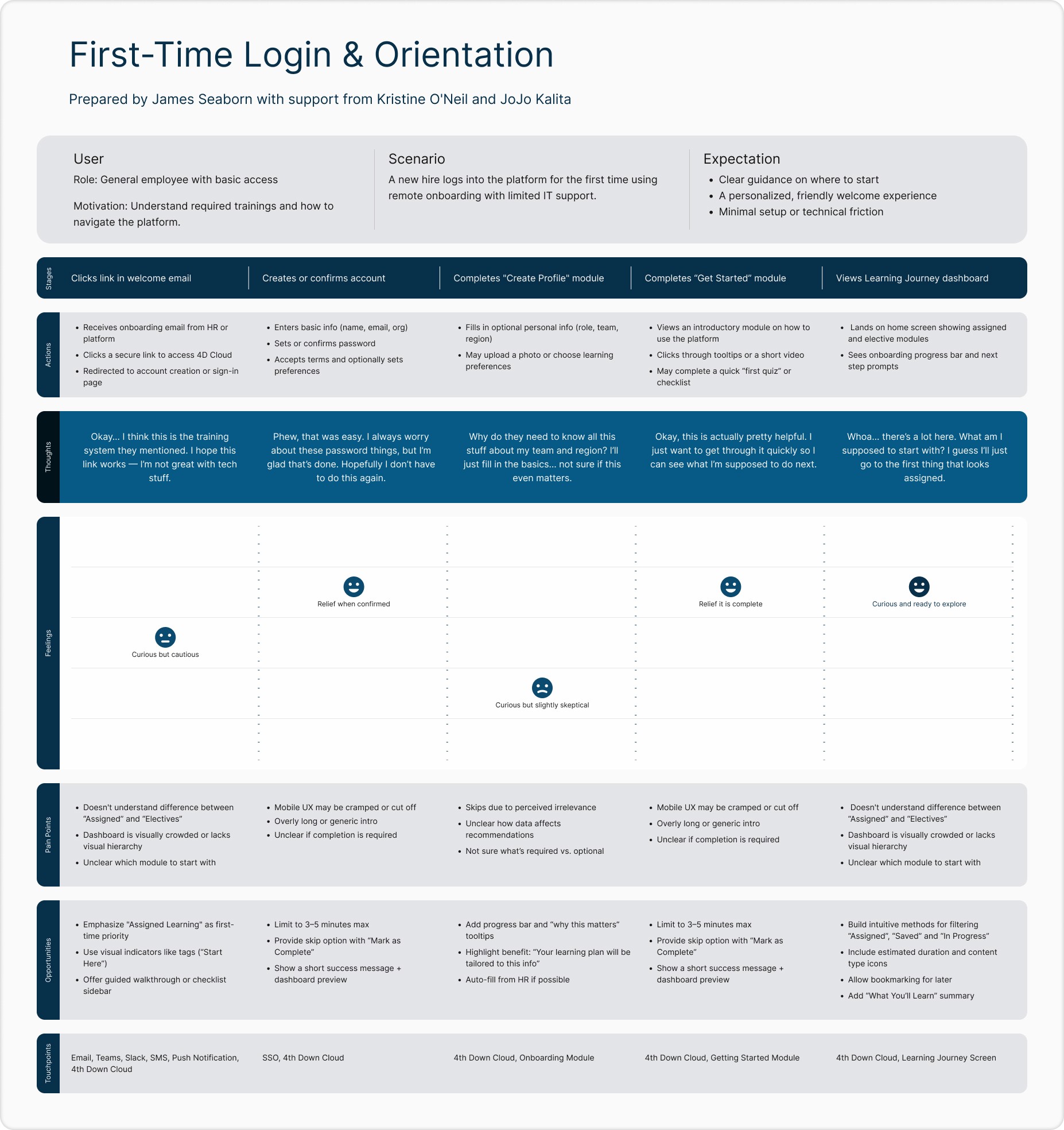
Research & Insights
Gathering the needs of each of these stakeholder types involved extensive discussion of what was essential about the current platform and what opportunities we could find in the new platform. We selected representatives from each stakeholder group and had multiple co-creation sessions:
Stakeholder interviews across product, engineering, and client services.
Legacy platform user behavior and usability breakdowns.
Client feedback post-COVID, which emphasized a need for virtual-first, customizable, and measurable learning environments.
We identified these core goals:
Internal Needs:
Systems for creating consistent yet customizable frontend.
Infrastructure for a realtime data pipeline.
Predictable data entities.
Clients needs:
Control of customization and branding.
Flexibility and new features in learning content and training exercises.
Realtime feedback about learner progress.
Users needs:
A more consistent and intuitive experience.
Better organization and discoverability of learning content.
Better feedback about progress.
The Strategy
The resulting research led to an overall strategy that aligned on 4 main goals.
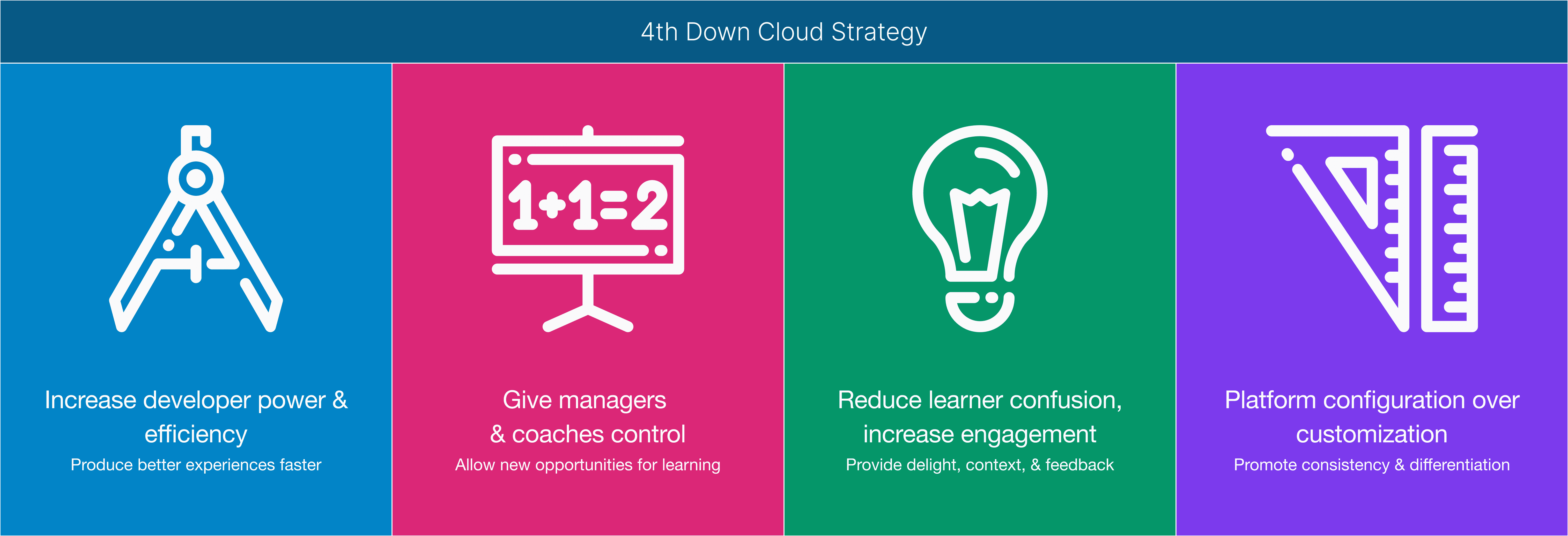
We initiated the design and development of 4th Down Cloud, a modular SaaS platform with consistent UX, flexible theming, and web-first capabilities.
Key objectives included:
A core navigation experience called "Learning Journey" that provided consistent UI language across clients.
A centralized backend architecture built for multi-tenancy and integrations with LMS and enterprise data flows.
Platform conventions around scoring and progress to provide feedback to both learners and coaches.
A flexible design system and component library with dynamic theming support.
The shift enabled clients to deliver remote training at scale, with faster deployments, real-time data access, and a more polished brand presence.
Based on these objectives, we organized work streams into parallel work based on stakeholder responsibility.
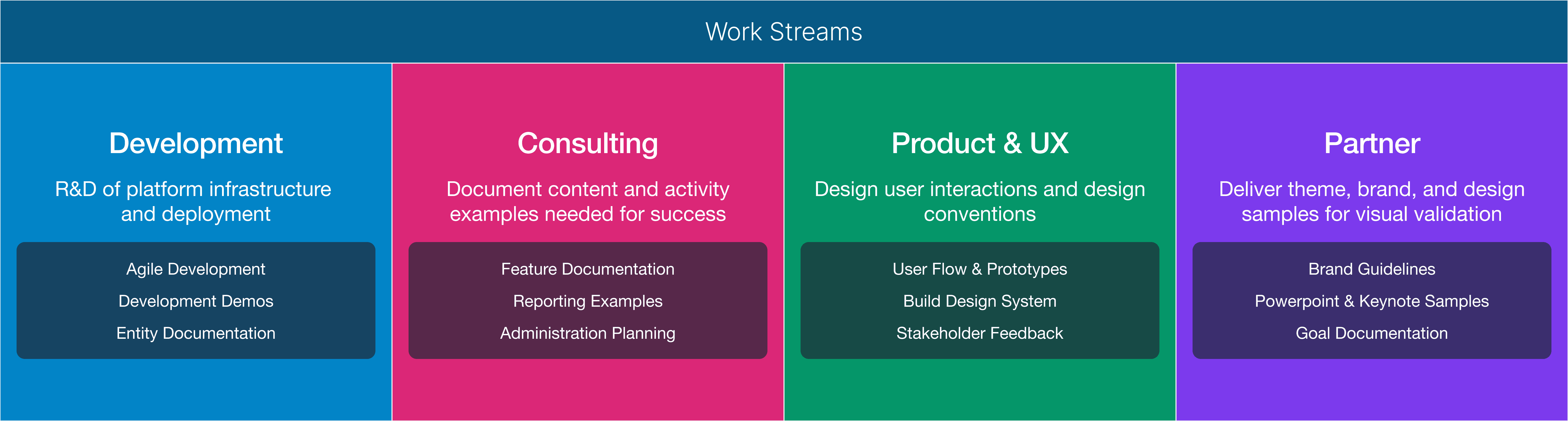
Design Process
The Product & UX team was responsible for cross team coordination. As each team produced a work artifact, we would review, validate, and provide feedback. Each Friday Product & UX would facilitate a cross-team alignment session with an agenda focused on ensuring each team was up to date and able to provide feedback.
Information Architecture
A key element of the UX & Product team was to synthesize the artifacts from each work stream into a consistent structure behind the content — what we came to refer to as the platform’s atomic system. We were no longer building isolated programs or standalone sessions; we were building a system. That meant identifying the foundational objects that would power all learning experiences going forward.
The goal was to define a core object type that could support flexibility at scale: configurable enough for creative teams, structured enough for developers, and predictable enough for enterprise delivery.
A sample of each atomic object's attributes:
Type – The object category (e.g. session, module, asset, interaction, document…)
Name – A consistent identifier that stayed readable across systems
Thumbnail – Optional visual preview for the learner-facing interface
Header / Header Background – Framing visuals and titles that appeared at the top of each content piece
Short Description – A brief overview used in tiles and summaries
Description – The rich text description to give context to the object
Completion – Rules or signals that triggered the object to be marked as complete
Score – Any performance data that could be passed through to reporting
Availability Date / Due Date – Scheduling controls for program delivery
Status – Internal labels for tracking progress, review, or publishing
Required – A simple flag for mandatory items
Design Tokens – Consistent visual definitions for spacing, color, and typography
Attachment – The interactive element of the object (PDF, video, assessment, podcast…)
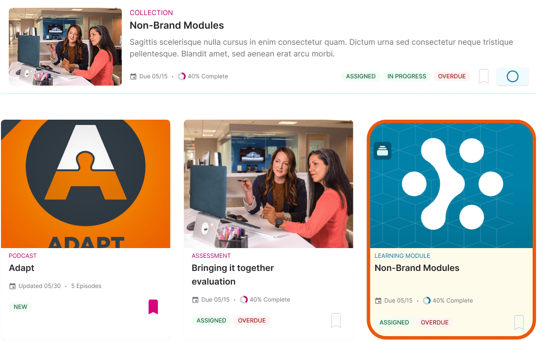
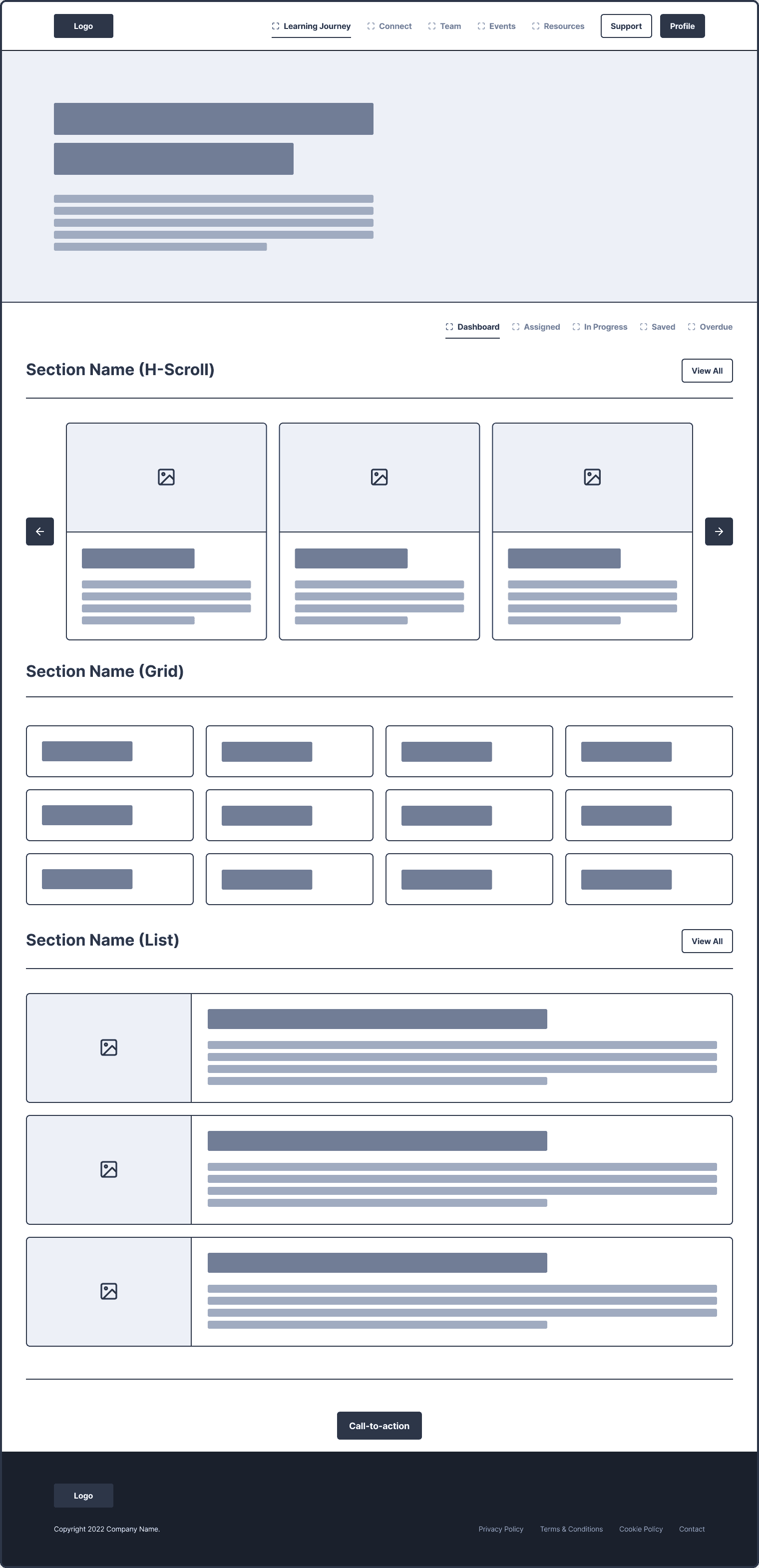
You can see how some of these elements are collected into various UI elements:
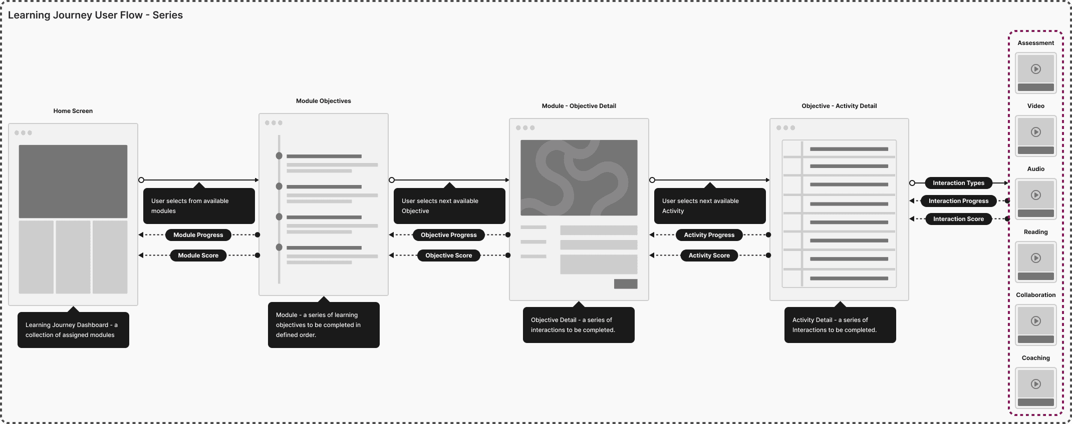
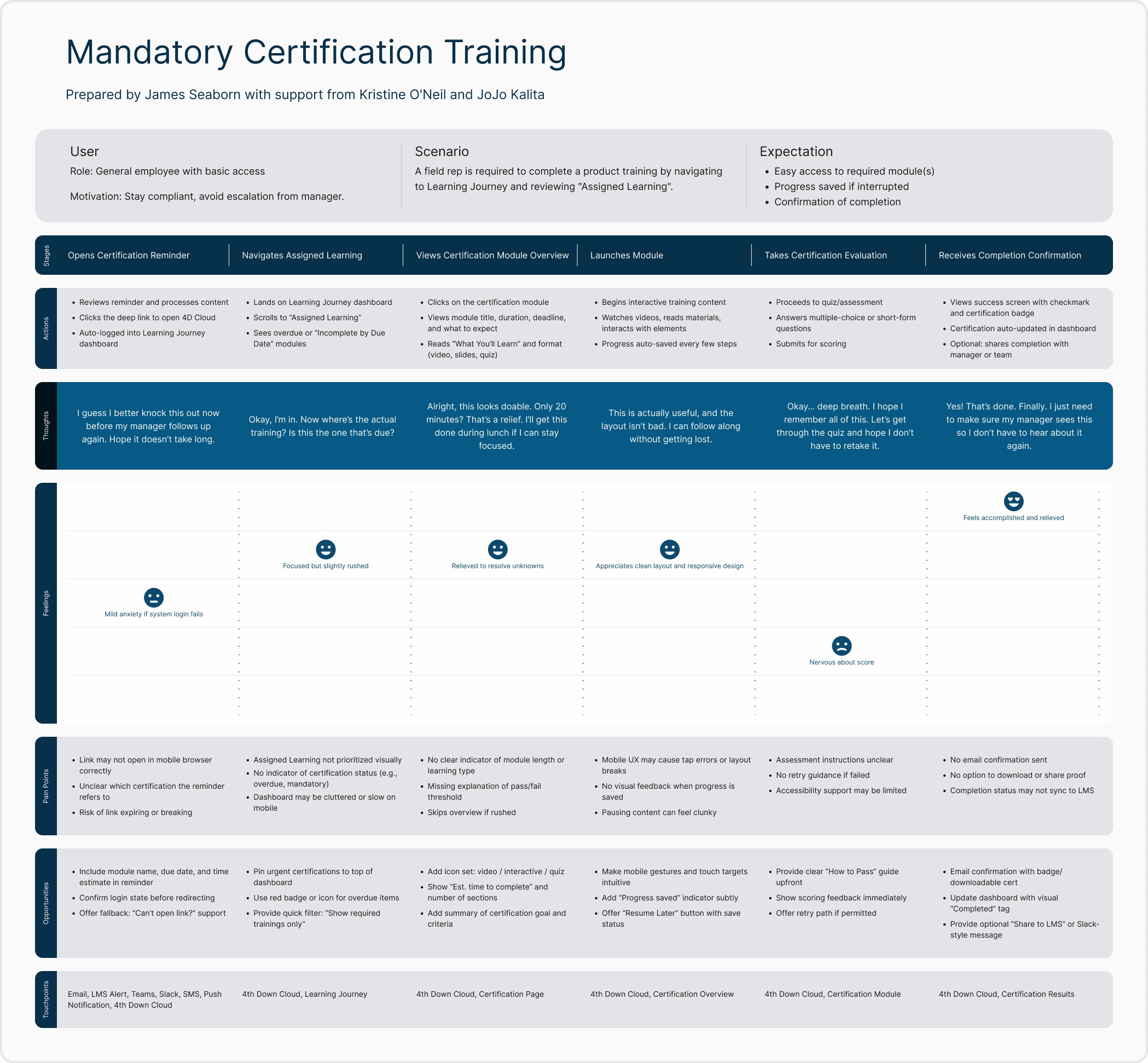
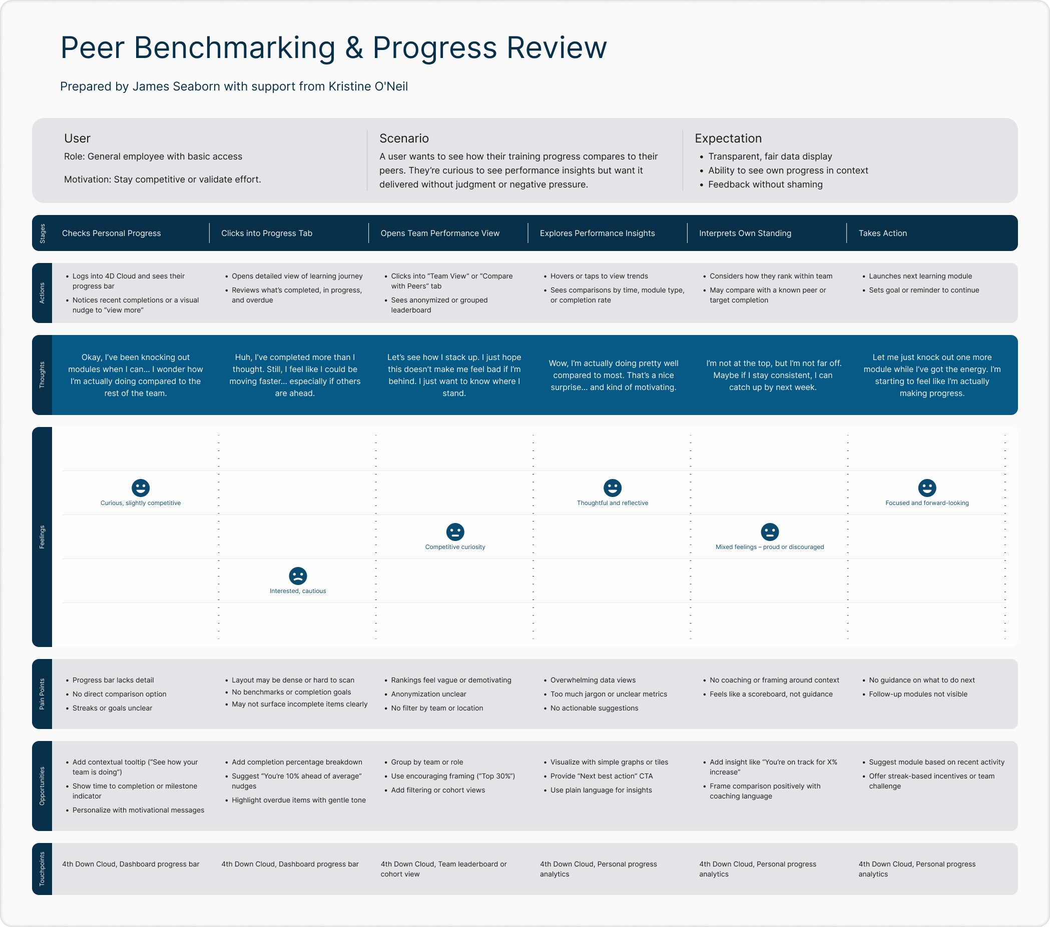
User Flows
Each of these objects could be connected together into structures. Select object attribute could be collected into a data flow, providing users with feedback on their work (progress, scoring) .
UI Wireframes
Wireframes were used to define how these elements would be composed together into user experiences. This is where we focused on solving problems like:
Screen layout
Information architecture
Interaction conventions
Content discoverability
Navigation context
Common components
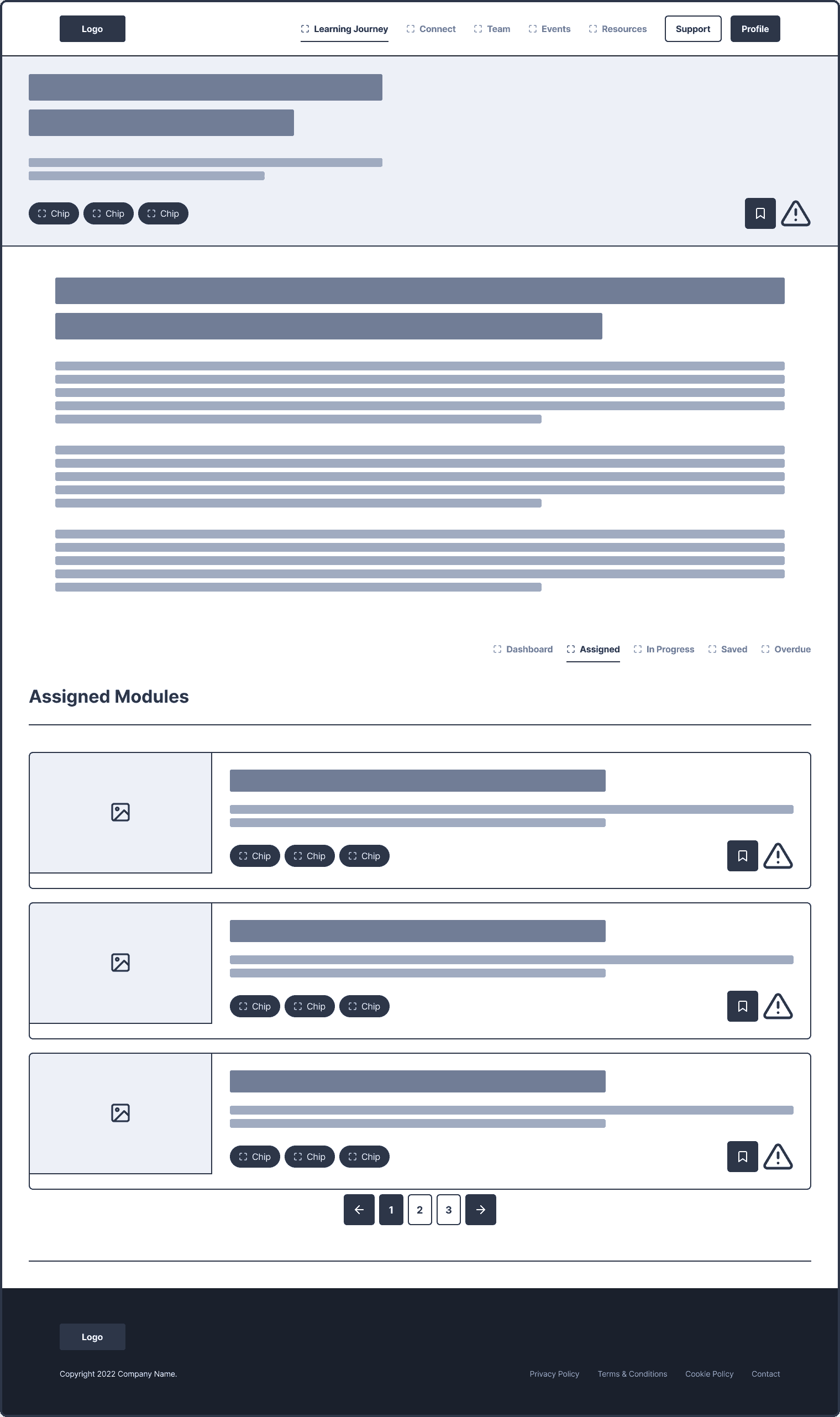
UI Mockups & Prototypes
Using UI Mockups product team could flesh out design conventions and ideate on key elements like status, progress, scoring and due date. These
Additionally, this process allowed us to ideate on what theming features would be needed to fulfill client branding needs.
Rapid prototyping process:
Conducted comparative UI reviews of legacy deployments.
Built a Storybook-based design system with reusable components and consistent tokens.
Applied atomic design principles via Tailwind CSS and React to unify fragmented platform experiences.
Transitioned to a platform lifecycle model to balance stakeholder requests with system-wide consistency.
Along the way, we delivered internal tools and schemas to improve development efficiency, standardize configuration, and enable data interoperability. A major breakthrough in driving both efficiency and consistency across the platform came through the development of tightly aligned Figma libraries. These libraries weren’t just static design assets — they were built with structured properties that directly mapped to the React component library used by engineering. By maintaining a shared design system with clearly defined variants, states, and constraints, we eliminated guesswork between design and development. This alignment reduced rework, accelerated handoff, and ensured that what we prototyped was what got built. It also gave product teams a single source of truth, making it easier to scale design patterns across features without sacrificing quality.
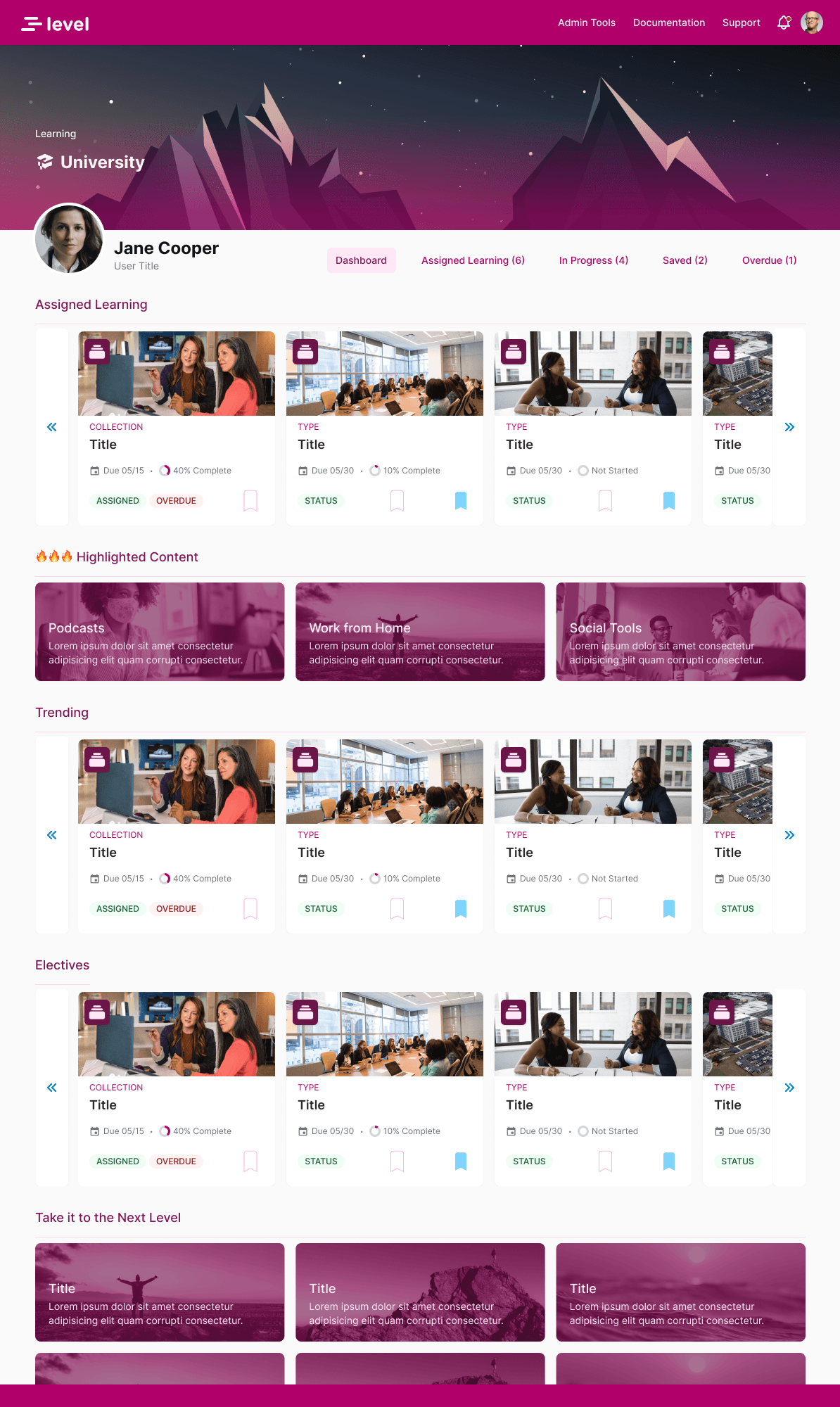
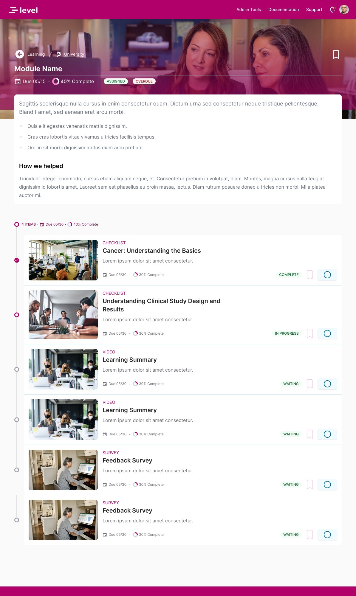
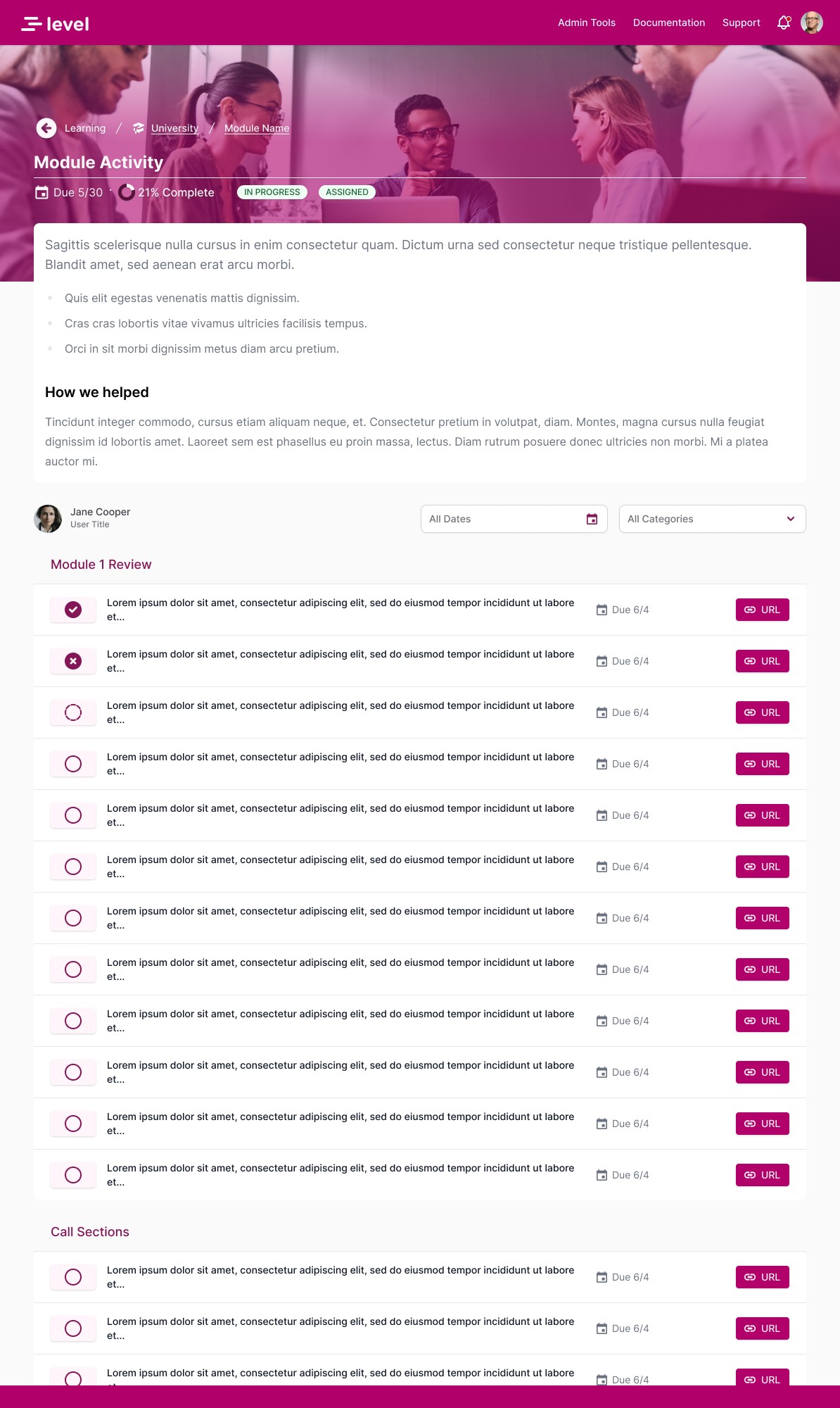
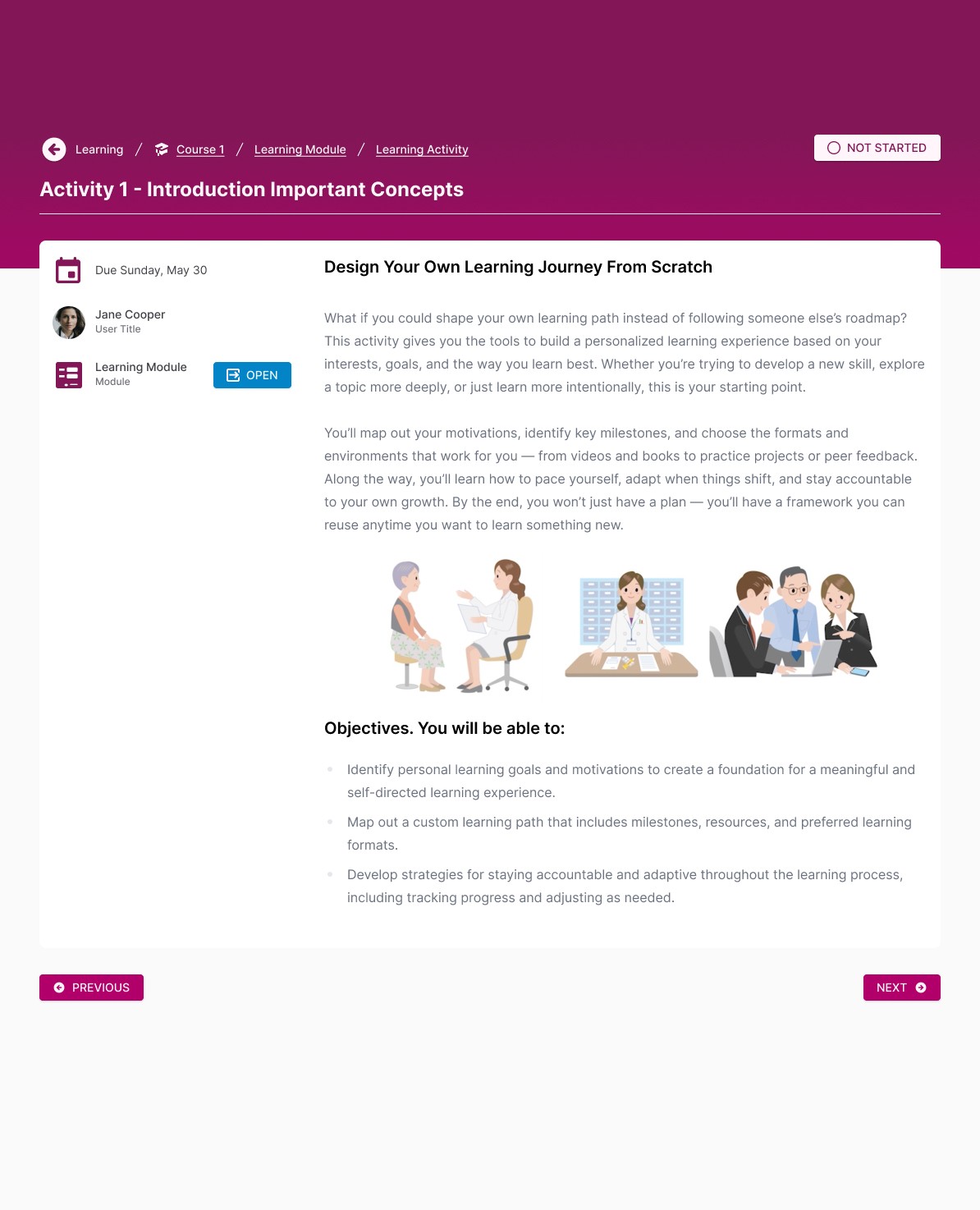
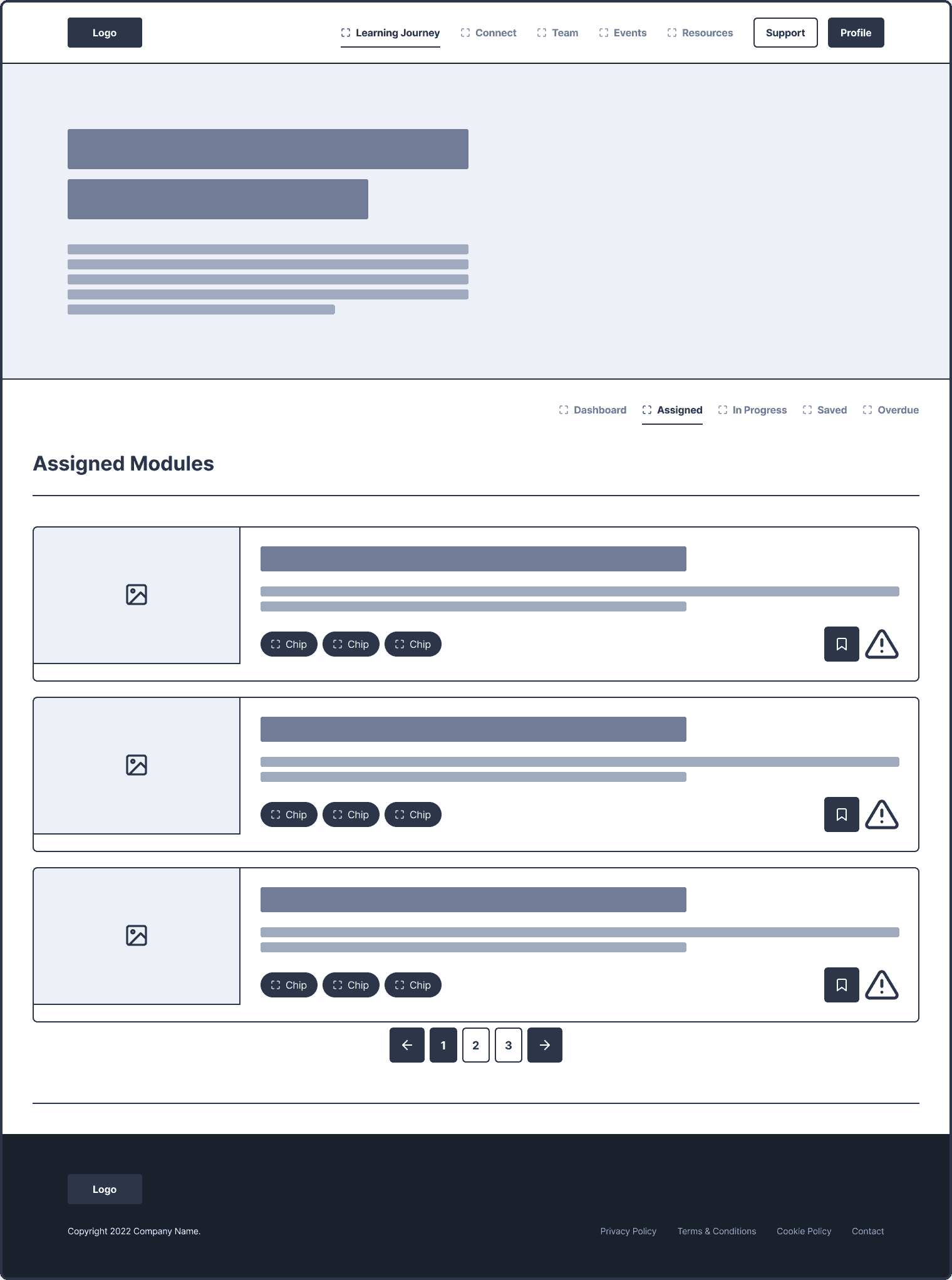
Final Designs
The updated interface brought consistency and clarity to the platform:
Clean, modern layouts optimized for both mouse and touch interaction.
Flexible theming capabilities that allowed for deep brand expression per client.
Streamlined navigation that reduced learning curves for end users.
A new Learning Journey experience that connected content, tasks, and evaluations in a personalized flow.
Outcomes
Quantitative Impact (estimates based on team reflection):
70% reduction in client-reported UX issues.
Up to 80% improvement in development speed due to component reuse.
90% of visual and navigation bugs caught during staging, vs ~25% in the legacy system.
75% of total users migrated to the new Learning Journey system within the first year.
Retention of over 70% of clients post-COVID, representing thousands of end users.
Qualitative Impact:
Brought alignment across product, engineering, and client teams for the first time.
Empowered junior engineers with reusable, consistent front-end patterns.
Reframed how stakeholders viewed scalability—less as custom effort, more as configurable experience.
Reflection
The move to 4th Down Cloud wasn’t just a technical or visual redesign—it was a cultural shift. It established scalable foundations, brought discipline to product operations, and delivered a better experience for everyone involved. It also made it possible for teams to say “yes” to clients more often—without breaking the system to do it.

